An Interactive Bokeh App for NBA Stats Exploration
After scraping and cleaning NBA data from multiple sources — player bios and advanced stats, lineup aggregates, and full play-by-play logs — the next step was to explore it. Static Jupyter notebooks are fine for one-off analysis, but comparing players across dozens of stats, or checking how a specific lineup or game unfolded, quickly becomes tedious when you have to re-run cells and tweak filters by hand.
I built a small Bokeh application that loads the same CSVs used in the Data_Exploration notebooks and exposes them through three interactive tabs: Player Stats, Lineup Stats, and Game Play-By-Play. The app runs locally (bokeh serve --show bokeh_app/) and lets you filter and plot without touching code.
How the App Is Structured
The app lives under bokeh_app/ in the nba-data-models repo. main.py reads three datasets: a merged player-season CSV (combining draft combine, bios, and advanced stats), a lineup-stats CSV, and a play-by-play CSV that includes per-stint plus-minus and possession counts. Each tab is implemented in its own module under tabs/ and returns a Bokeh Panel; the main script assembles them into a single Tabs widget.
Player Stats Tab
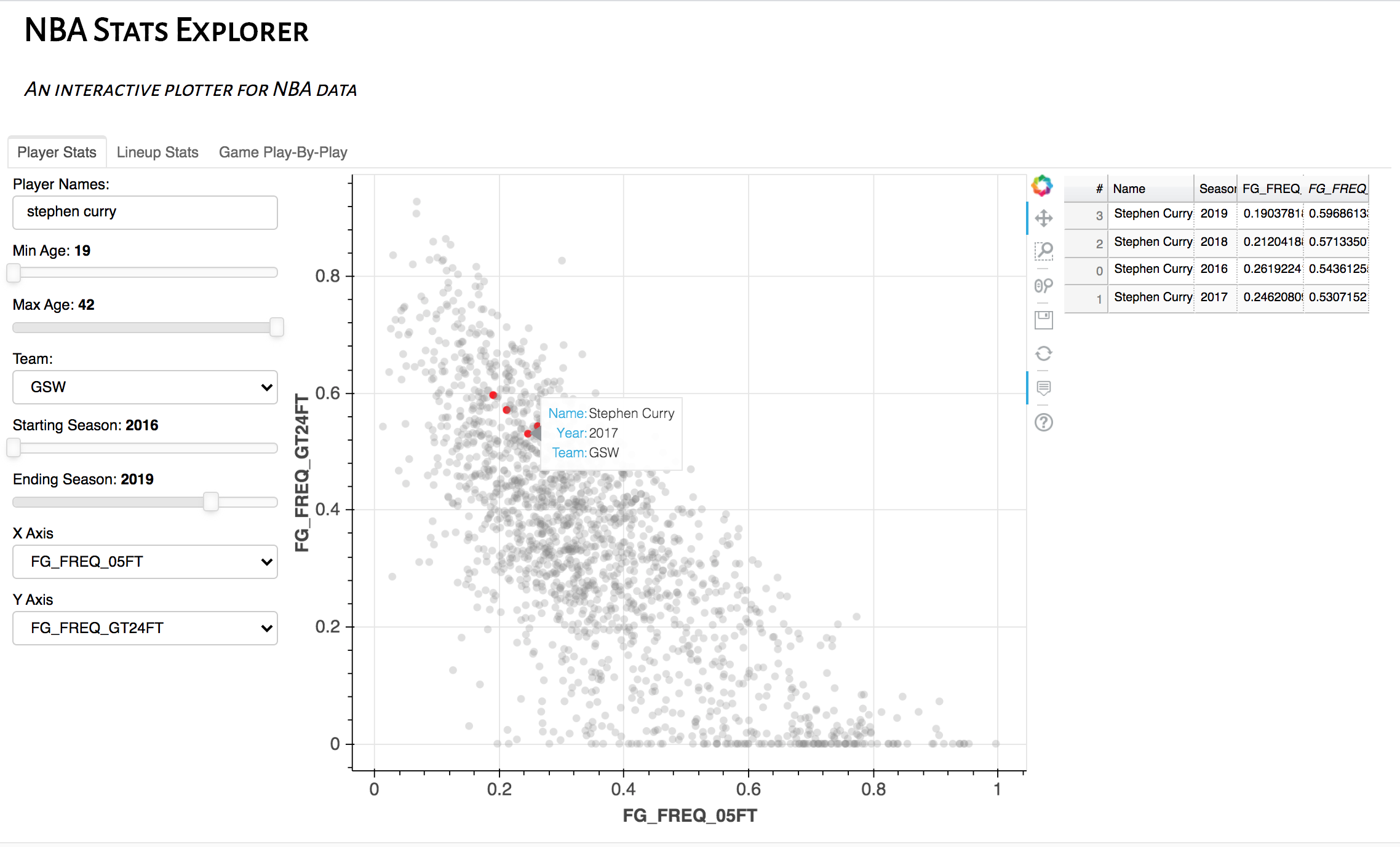
The player tab uses the same kind of data explored in Player_Data_Exploration.ipynb: hundreds of columns per player-season (shot location frequencies, rates, play-type usage, defensive metrics, etc.). The UI provides:
- Filters: player name (substring), team, season range, and age range.
- Axis dropdowns: any two columns can be chosen as x and y for a scatter plot.
Points matching the current filters are highlighted in red and listed in a data table; the rest stay in the background in grey. That makes it easy to compare a single player across seasons or to see how they sit relative to the league in any two stats (e.g. frequency of shots at the rim vs. from beyond 24 feet).
Lineup Stats Tab
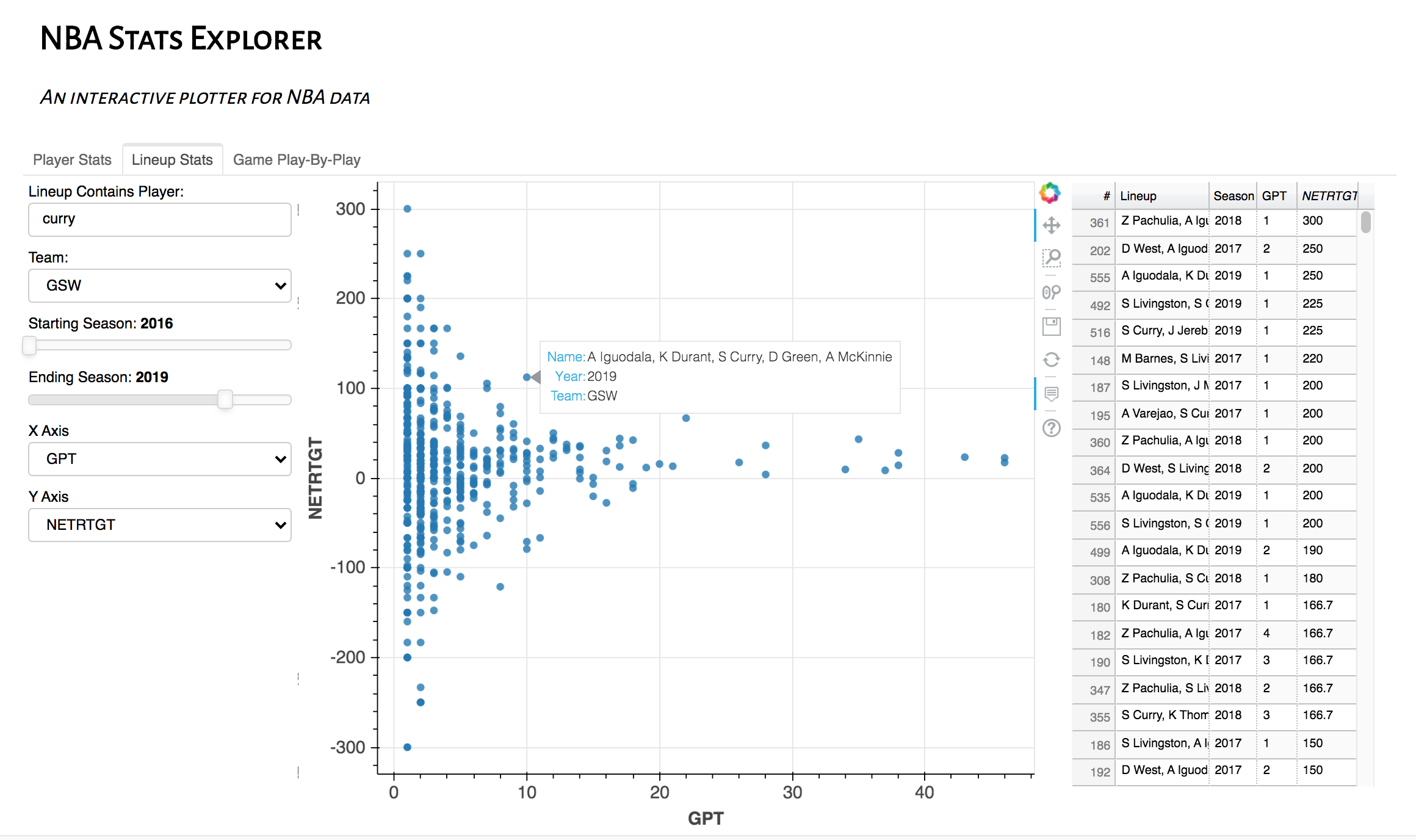
The lineup tab is driven by the same aggregated lineup data used in Lineup_Data_Exploration.ipynb. You can restrict by team, season range, and “lineup contains player” (substring on the lineup name). Again, x and y are any two columns — e.g. points per 100 (GPT) vs. net rating (NETRTGT). The scatter plot and table show only lineups that pass the filters, so you can quickly see how lineups that include a given player perform in different metric spaces.
Game Play-By-Play Tab
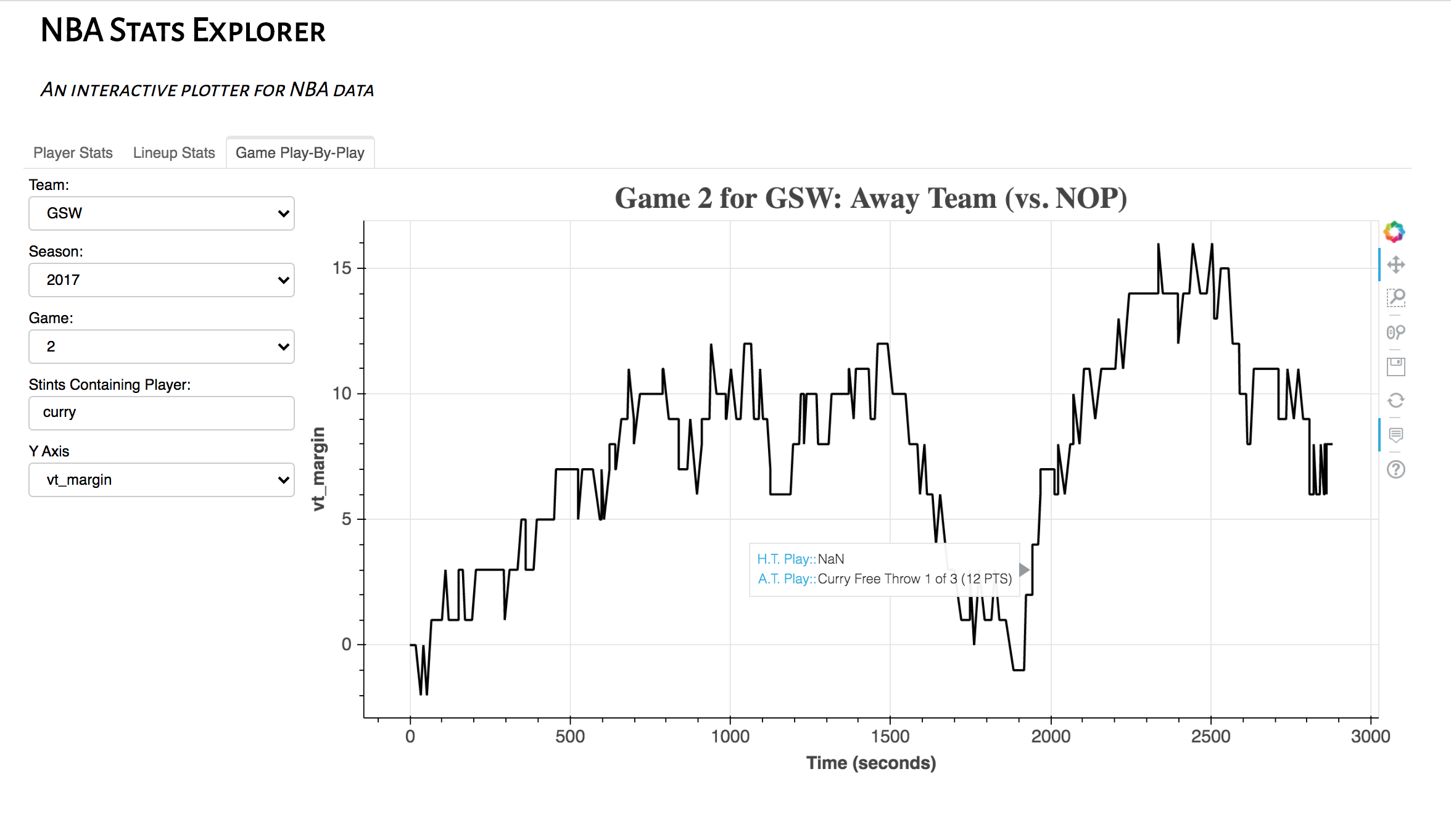
The play-by-play tab is tied to the stint-level data and logic in PlayByPlay_Data_Exploration.ipynb. You pick a team, season, and game number (1–82). The plot shows one chosen series (e.g. home-team margin) on the y-axis vs. time in seconds on the x-axis. An optional “stints containing player” field highlights stretches when that player is on the floor (box annotations), so you can visually tie runs or slumps to specific rotations.
Why This Is Useful
The Python notebooks do the heavy lifting for data scraping and aggregation: defining data cuts, computing correlations, and performing clustering (e.g. by position). The Bokeh app doesn’t replace that; it turns the same CSVs into a quick exploration front end.
You can try many axis pairs and filters without re-running code, compare a player’s lineups or their presence in a specific game, and sanity-check patterns before digging into analytics or modeling (e.g. the RAPM or player comp work).
All of the code — scraping, exploration notebooks, and the Bokeh app — is in the nba-data-models repository.